What makes a brilliant Young Adult book cover?
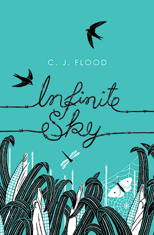
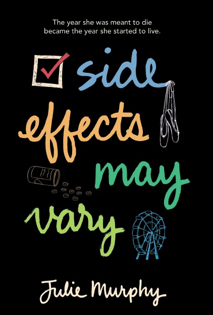
My eyes have gone blurry today from trying to answer this question as I put together my brief to send to my designer for the cover of The Day We Are Born. What I have come up with are my top three Young Adult contemporary covers from books I've read this year. I'm leaning towards a cover without a person on it, so this is reflected in my choices:
I love the titled written out of what looks like the telephone wires on the Infinite Sky cover, the different colors of the Side Effects May Vary title, and The Sound of Letting Go's font. (My observations clearly colored by obsession with fonts this morning - type, size, color - it's all mind boggling.)I found this hilarious - but pretty accurate - article called How to Judge a YA Book by its Cover - on what's hot and what's not in YA cover design - read it here.


No comments:
Post a Comment
Post a Comment